YouTube for Android gets updated with improved layout for settings

YouTube has started rolling out a new update to its Android app which improves its settings layout and video player.
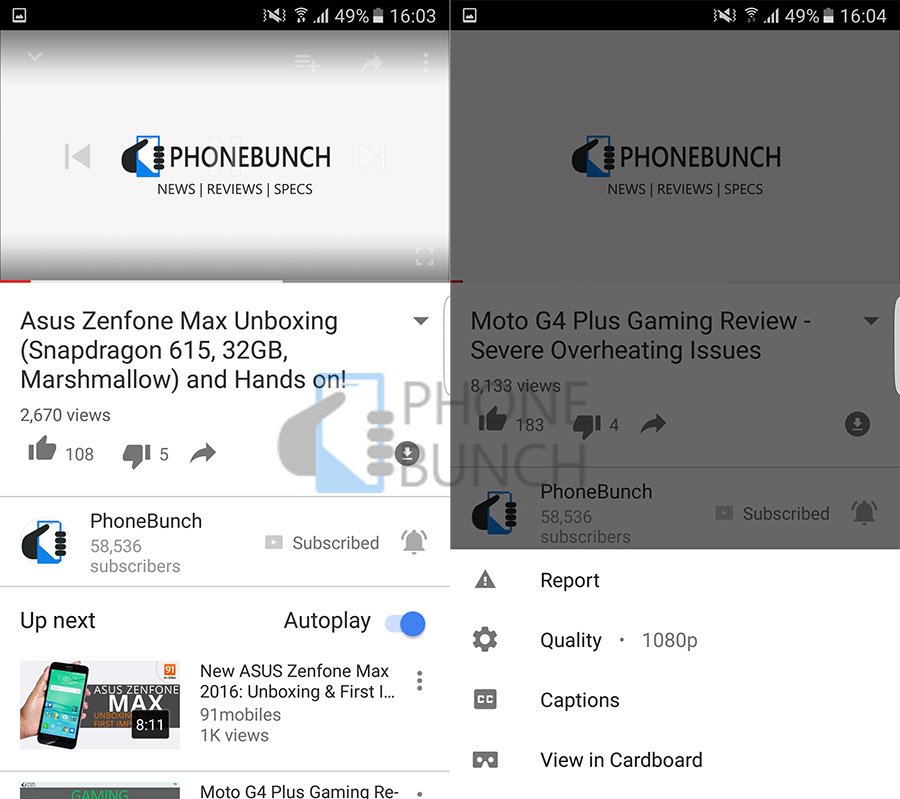
The biggest change is to the settings menu which now instead of overlaying on the video scrolls up from the bottom of the screen. Its more elegant and less obtrusive. You can access the re-vamped video settings by just tapping on the overflow button which allows you to choose video quality, Captions and also View in Cardboard. The new design works in landscape orientation as well.

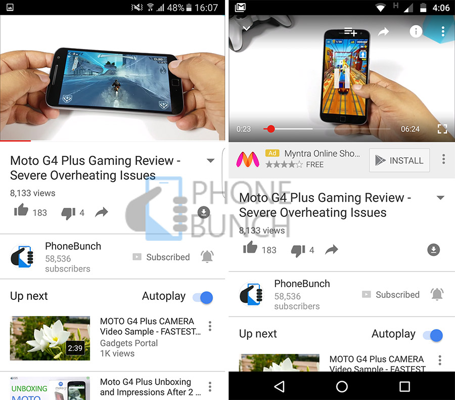
The video player has been re-designed as well. Earlier the progress bar used to be visible when you tapped on the video as an overlay, now you can see a red progress bar at the bottom of the video window. Both improvements are just superficial but they do add to the overall user experience. Google has been experimenting a lot with YouTube's design both online and offline, its good to see some of these changes take shape.
| Can Oppo beat Samsung in launching a Foldable Smartphone? | Samsung Galaxy Tab Iris launched in India to carry the torch for paperless authentication |


