This was Nokia's first Android Smartphone
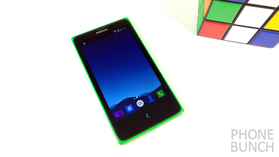
The Nokia X was launched way back in February 2014 running Android Jelly Bean. Although it would make for a great story to think about a coup within Microsoft where a small team of Nokia engineers decided to go rogue and make an Android smartphone. The reality was much less exciting.
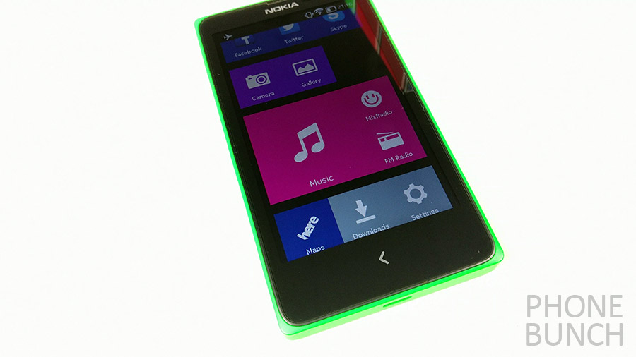
Nokia removed all essence of Android from its X line-up and almost make it look like Windows Phone. You had tiles which could be moved or resized. But this was not a half-hearted effort. It seemed Nokia had been working on this for quite some time. Starting with the Nokia store which had some big titles even at that time, to the interface itself which was intuitive in its own way. All apps resided on your home screen, something we see quite often nowadays where they could be moved or uninstalled by a long tap.
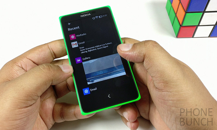
Then you had Fastlane to see everything you did on the phone including all your recent apps and tasks. At this time, stock Android didn’t offer options like cleaning all tasks at one go, it was present on the Nokia X. The single button behaved as a back key on single press and on long press as a home button.
Video: Nokia's first Android Phone
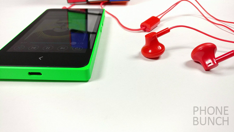
And how can we forget the legendary build quality of Nokia smartphones. This was a time when all smartphones didn’t have be gold in color or made of metal or glass. Much simpler but exciting times, when you could have a green, cyan, red or orange phone. Nokia’s design team excelled in making smartphones that looked different, unique. But even then these were consumer centric devices with dual-SIM slots, separate memory card slot and removable batteries, which people preferred. Trust me, this phone is still quite usable.
Coming back to software, the lack of menu button and a separate home button did need some changes to be made to the UI. So Nokia made gestures to kill apps. Just swipe from the left on any app and you are back at the home screen. Although not all elements made sense like the continuous scrolling Fastlane and tiled home screen. You could also switch between SIM cards from the status bar. They also incorporated universal search within the launcher and you could easily search for any app on your phone or even online with just a tap.
Even back then it ran on sort of older hardware, the Nokia X was optimized to run well. Dual-core Snapdragon S4, 512MB RAM didn’t really scream performance but they worked on software. Another great interface element was the sliding menu. You could clearly see the Windows Phone elements in play here. In Apps that had menus, you would see a three line symbol which you would just pull up to open the menu. Although this didn’t work with all apps. And just as I said earlier, this was being worked on quite some time and Nokia found a way to even include a fully configurable equalizer within the music app.
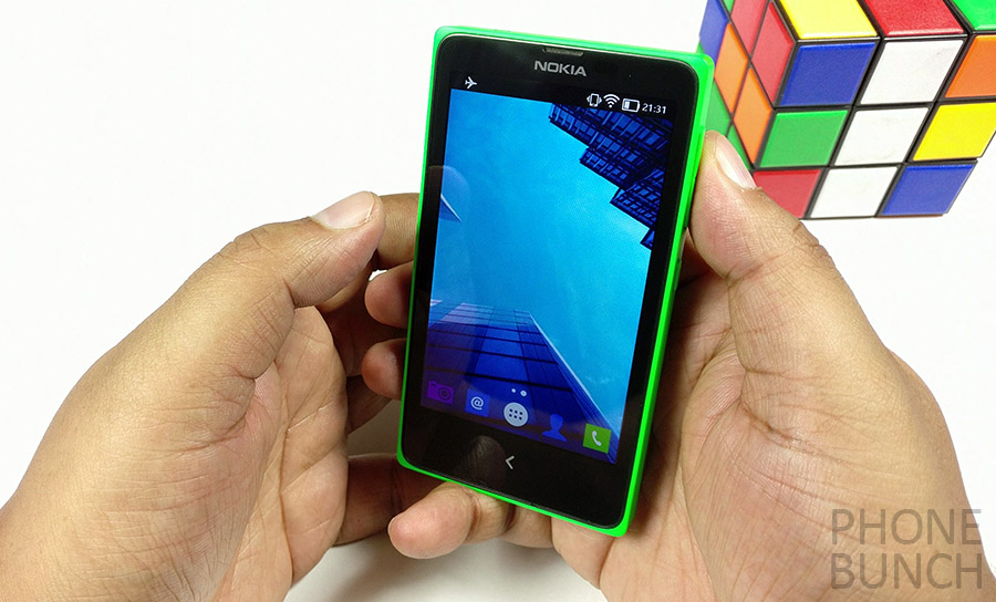
With Android running at the heart of it, you could always sideload apps and Nokia wasn’t restricting it. In fact, call me the optimist, they actually made it easier to use third party launchers with the last update to the Nokia X platform. Because you couldn’t access fast lane apart from the default launcher, they added a multitasking button in the quick toggles tray up top from where you could see all open apps. They couldn’t change the hardware button configuration but they made it work somehow.
Just think about it, you had Glance Screen with notifications, double tap to wake and easy gestures to interact with the phone’s UI. There were people at Nokia who thought about moving to Android before the jump to Windows Phone was made and their efforts clearly showed here.
Now while we reminisce, there is a new Nokia waiting to rise from the Ashes. It may not take the same form again and only time will tell what it becomes, but I believe its essence will still be there in their new products.
| ChampOne C1 4G smartphone with fingerprint sensor for Rs. 501 is just another scam | OnePlus One gets working Android Nougat port |


