Nothing Phone (2) Video Surfaced Online revealing Design, New color, Glyph LEDs Features

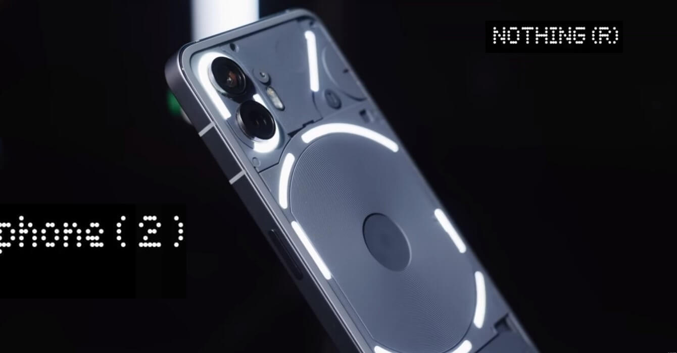
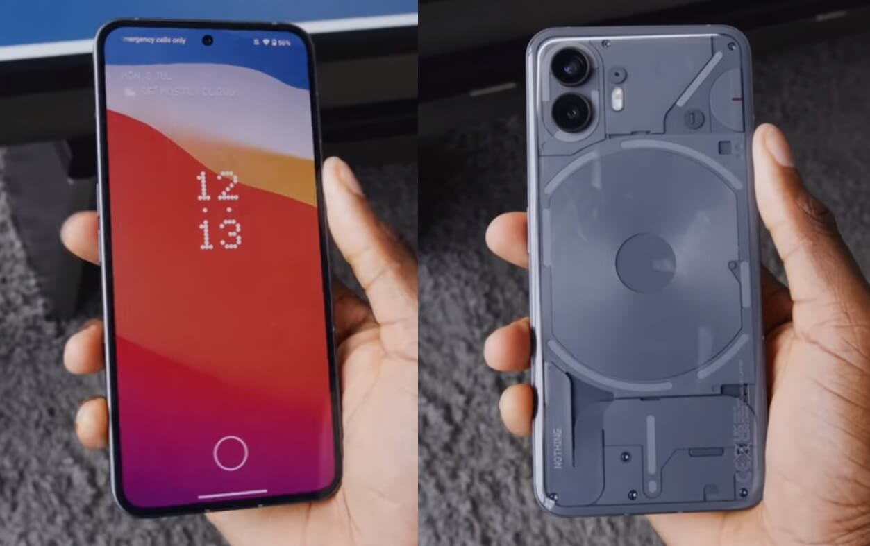
Nothing already confirmed the launch date of the Nothing Phone (2) in India on July 11th. Additionally, the phone reveals a center-aligned punch-hole camera on the front and a back panel design that incorporates multiple LEDs for the glyph interface, which is used when showcasing the glyph composer.

Today, YouTuber Marques Brownlee posted a video that reveals more details about the Nothing Phone (2) LEDs, color, and design. It shows a new grey color instead of Black in the previous model, and it should also come in a white version. It has the same flat display on the front, and the back is slightly curved.

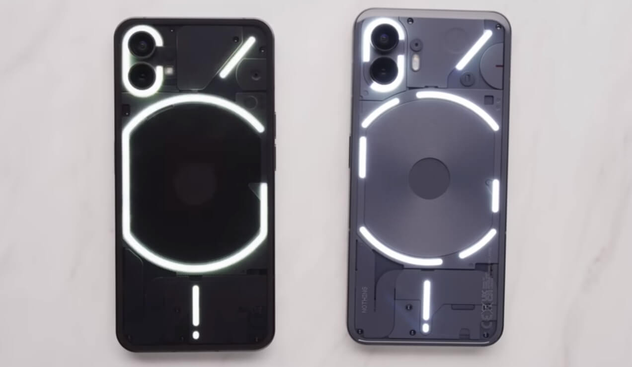
The arrangement of LEDs on the back of Phone (2) is reminiscent of Phone (1) but with some notable differences. In Phone (2), the central portion is divided into 6 separate sections, featuring a total of 33 addressable LED lighting zones, a significant increase from the 12 zones found in its predecessor. Notably, the top right section alone boasts 16 customizable lighting zones.

Uses of Glyph LEDs in Nothing Phone (2) -
- Volume indicator - The lights indicate as you increase or decrease the volume.
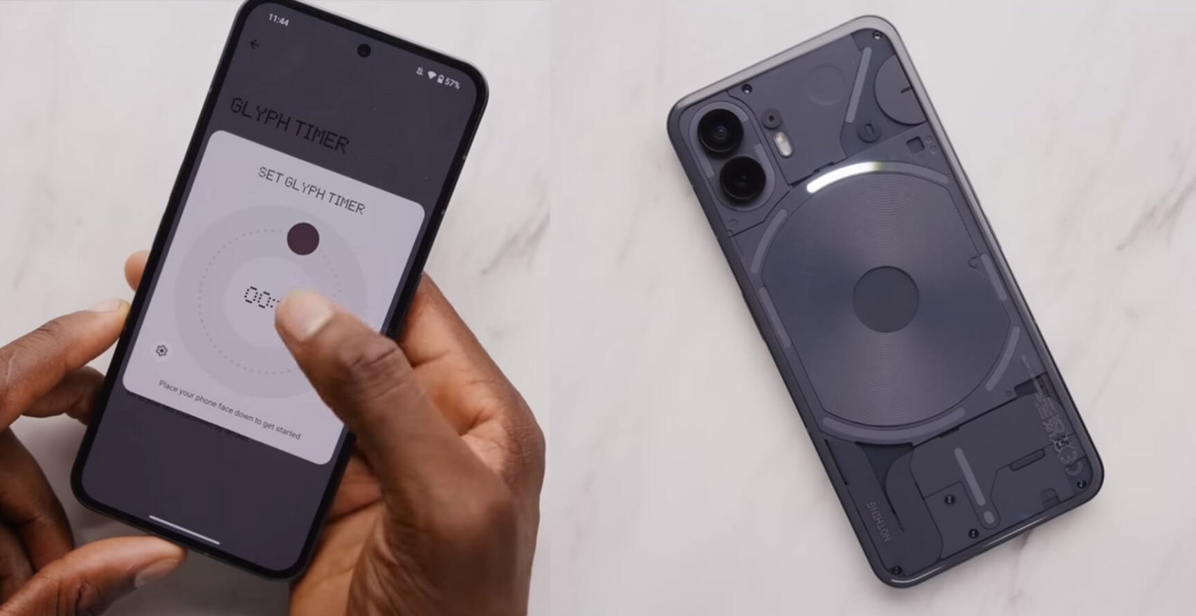
- Timer - The lights adjust according to the countdown of the timer.
- Uber and Zomato - The lights as a progress bar to indicate the time before the cab or food reaches you.
- App notification - You can set an app to always show the LEDs when receiving a notification.
When we plug the wired charger into the phone, the bottom LEDs still act as a progress bar. All these features useful work when you place the phone down. We should know more details and the full specifications of the Phone (2) in the coming days, before the phone goes officially launched next week.


